6 Scatter plot, trendline, and linear regression
Imagine that you are investigating the relationship between the size of a treat and the rate at which a dog wags its tail. You can collect data for a series of trials where a dog is shown a treat of a given size and you measure the rate at which it wags its tail. In this situation, the experimental factor (treat size) varies continuously rather than in discrete categories. To examine the effect that the experimental factor has on the response variable (the wag rate), we can plot each trial as a point on a type of graph called an X-Y scatter plot.
6.1 Creating a scatter plot in Excel
To set up a scatter plot in Excel, enter the pairs of data in two columns with each value of a pair on the same row. By default, Excel considers the column on the left to contain the horizontal (X) values and the column on the right to contain the vertical (Y) values.
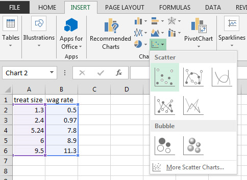
Select the block of cells to be included in the scatter plot by clicking and dragging, then from the Insert ribbon under Chart drop down the Scatter or Bubble menu and select Scatter. A chart will appear on the spreadsheet.

If you click on the + sign at the upper right of the chart, a list of checkboxes will appear. Check Axes, Axis Titles, and Trendline. Uncheck everything else. You should edit the Axis Titles to include the name of the factor and any units associated with it. Double-click on the Axis numbers to bring up the Format Axis dialog, then click on the bar-graph icon to access Axis Options. Set the bounds and units appropriately and set the tick marks to something sensible, like this:

6.2 What do we need a scatter plot for?
In the example above, we had Excel calculate and plot a linear trendline through the points. You should notice that the trendline is the best line that fits through the points. It may or may not actually pass through any particular points. That's why another name for trendline is best-fit line. In scientific graphs, one almost never "connects the dots". (There is another chart type that Excel makes which does that - don't use it!) The name of the process used to create the best-fit line is called linear regression.
When we fit the best line through the points of a scatter plot, we usually have one of two goals in mind. One important use of linear regression is predictive. In the example, we might like to predict how fast the tail will be wagged given a treat which is a size that we didn't specifically measure. If we know the equation of the best-fit line we can plug numbers into it to calculate the predicted value. The other important use of linear regression is as a statistical test of significance. In that case, we simply want to know if changing the size of the treat has a significant effect on the rate of tail wagging. We may not actually care about describing the way that the factors vary (the equation); we may just want to know if they vary significantly or not. In that case, what we want to know is whether the slope of the best fit line is different from zero or not. If the tail wagging rate were completely random and not affected by the size of the treat, the best-fit line would be horizontal, showing that the average wag rate was the same regardless of the treat size. A linear regression can facilitate both of these uses.
6.3 Regression as a statistical test
In the example to demonstrate how to create a scatter plot in Excel, we saw that the best-fit line through the treat size/tail-wagging rate data had a positive slope. However, one could make the case that tail-waging rate is unrelated to treat size and that it was simply a coincidence that the points on the right side of the graph were higher than those on the left side. Because there were only five data points, this would be a fairly likely outcome. We can frame this situation using the same language of Section 5.2. In a regression, our null hypothesis is that the slope of the best fit line is zero. When we conduct the regression statistical test, the software will calculate a value of P. Recall the general interpretation of P: if the null hypothesis were true, P is the probability that deviations as great as or greater than those seen in the sample would occur due to chance unrepresentative sampling. In this particular test, P states the probability that a slope as great or greater than that of the best fit line would occur due to chance deviations from an actual slope of zero. If the deviations from a slope of zero are great enough for the value of P to fall below 0.05, then we say that the best fit line differs significantly from zero. In this case, we additionally state that the factor graphed on the horizontal axis has a significant effect on the factor graphed on the Y axis.
In a simple one-factor experiment such as the blood pressure study example of Sections 4.2 through 5.3, we assume that the presence of the factor has a fixed effect on the size of the measured quantity in the trials. That effect manifests itself by creating a difference in the mean value of the measured quantity. In contrast, in a linear regression we assume that the experimental factor has a varying effect that increases linearly with the size of the factor. For example, we might test a drug by administering it in doses that vary from zero to some maximum value. In a regression-like experiment such as this, there is no single treatment level that is the control since every data point collected can have a different value. Regression and variants of regression such as multiple regression and analysis of covariance (ANCOVA) are some of the most common statistical procedures in use.
6.4 Descriptive information provided in a regression analysis
A regression analysis can provide three forms of descriptive information about the data included in the analysis: the equation of the best fit line, an R2 value, and a P-value.
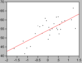
Fig. 14 Example of a linear relationship y= 6 x + 55, R2=0.56, P<0.001
Fig. 14 shows a plot of simulated experimental data. These data have a linear component that can be described by a best fit line having a non-zero slope. They also have a random component that causes them to be scattered somewhat around that best fit line. A regression analysis of these data calculates that the equation of the best fit line is y = 6x + 55 . Depending on the software used, this information may be provided as an actual equation, or the coefficient of X (i.e. the slope) and the intercept may be listed in a table.

Fig. 15 y= 6 x + 55; Left: R2=0.94, P<0.001, Right: R2=0.16, P=0.029
There are other patterns of data for which the best fit line would also be y = 6x + 55 . Fig. 15 shows two other sets of data which also have the same best fit line. A major difference between these data sets is the degree to which the points are clustered around the best fit line. The tightness of fit to the line is described by the quantity R2. Its value ranges from 0 (essentially a random cloud of points) to 1 (the points fall perfectly on a straight line). In the left side of Fig. 15 the points are very tightly clustered around the best fit line and the R2 value is very close to 1. In the right side of Fig. 15 the random component of the data is very large and the points nearly form a cloud. Subsequently, the R2 value is very low. Despite this low value, the best-fit line still differs significantly from zero because it is based on a large sample size.
Another interpretation of R2 is that it tells the fraction of the variance that is explained by the best-fit line. An R2 of 0.94 means that 94% of the variance in the data is explained by the line and 6% of the variance is due to unexplained effects.
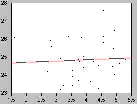
Fig. 16 Example where y is not significantly related to x. y= 0.070 x + 25, R2=0.0030, P<0.77
Fig. 16 shows a dataset in which the X factor has no significant effect on Y. Random effects cause the value of y to vary, but the points do not vary systematically with x. The value of P is accordingly high, indicating that it is probable that the slope could deviate from zero by this amount based solely on chance.
6.5 Adding the equation and R2 of a trendline in Excel
To display the equation of the best-fit line, click on the plus sign at the upper right side of the graph box. Mouse over the Trendline option and click on the triangular arrow at the right of the option to bring up the Trendline dialog options list. Click on More options… which will bring up the Format Trendline dialog box. Click on the "Display Equation on chart" and "Display R-squared value on chart" checkboxes. Dismiss the dialog box by clicking on the X in its upper right corner. You can click and drag the equation around the graph box until it is located in a spot that does not interfere with the display of the points.
6.6 Performing a Linear Regression Analysis Using Excel
Note: to perform the statistical tests in this section, you must have enabled the Data Analysis Tools in Excel. This has already been done on the lab computers but if you are using a computer elsewhere, you may need to enable it. Go to the Excel Reference home page for instructions for PC and Mac.
To calculate the statistics associated with the trend line using a linear regression analysis, click on the Data ribbon. Click on Data Analysis in the Analysis section. Select Regression, then click OK. Click on the Input Y Range: selection button, then select the range of cells for the column that contains the Y values. Click on the Input X Range: selection button, then select the range of cells for the column that contains the X values. Note: if there is a text label above the column of numbers, you can select it and check the Labels box. If there is no text label above the column, select only the numbers and do not select the Labels box. To put the results on the same sheet as the column of numbers, click on the Output Range radio button then click on the selection button. Click on the upper left cell of the area of the sheet where you would like for the results to go. Then press OK.
The Summary Output contains more information than we are interested in at the moment. However, if you already had Excel place the equation for the line and the R2 value on the chart, you can compare them with the output table. You will find the R Square value in the Regression Statistics section. Ignore the ANOVA table. In the last table, the value of the Intercept will be found in one line under "Coefficients" and the slope will be listed as the coefficient for the row that either contains the column label (e.g. "wag rate") or "X Variable 1" (if there was no column label). The actual P-value for the regression is found in the same row under "P-value".
